Project: DREAM WRLD
Client: CLUTCH Magazine
Problem: Clutch's new creative director recruited me to rebrand and revitalize the magazine's perception: a maximalist, colorful atmosphere to grab the attention and inspire today's youth for Fall/Winter 2022.
Solution: A magazine cover with a modern, bold design and a new logo that resonates with the magazine's target audience and overall look for the season.
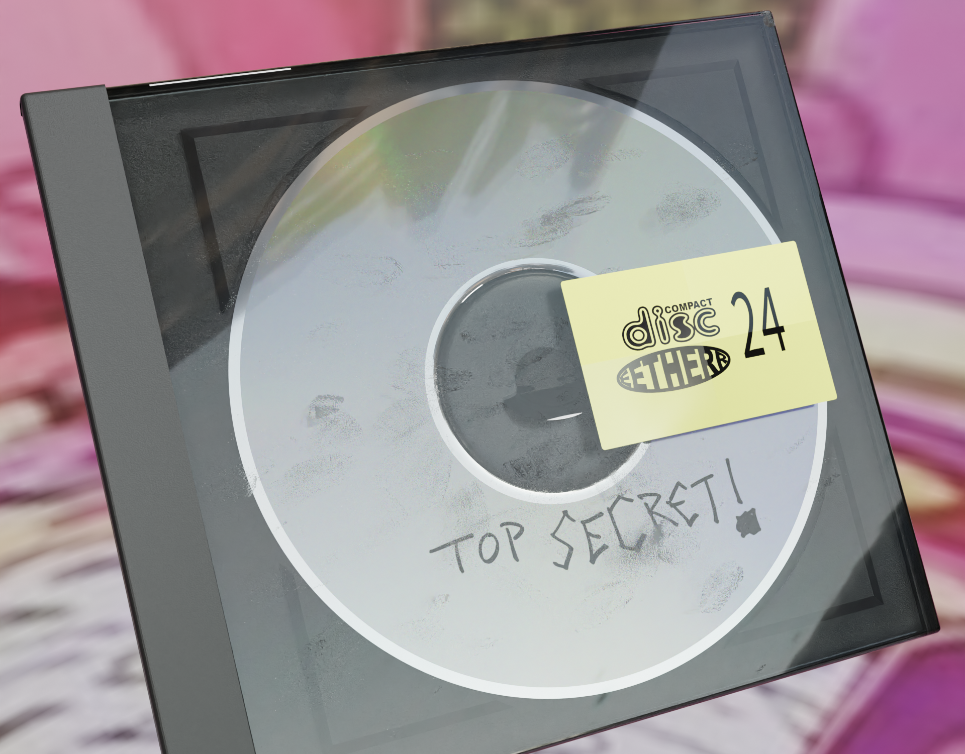
Result: I created 3-dimensional renders using Blender, a free and open-source 3D creation software that is up and coming in the design, game, and film industry. It features a variety of tools for modeling, animation, texturing, rendering, and compositing, as well as support for multiple file formats and third-party plugins.
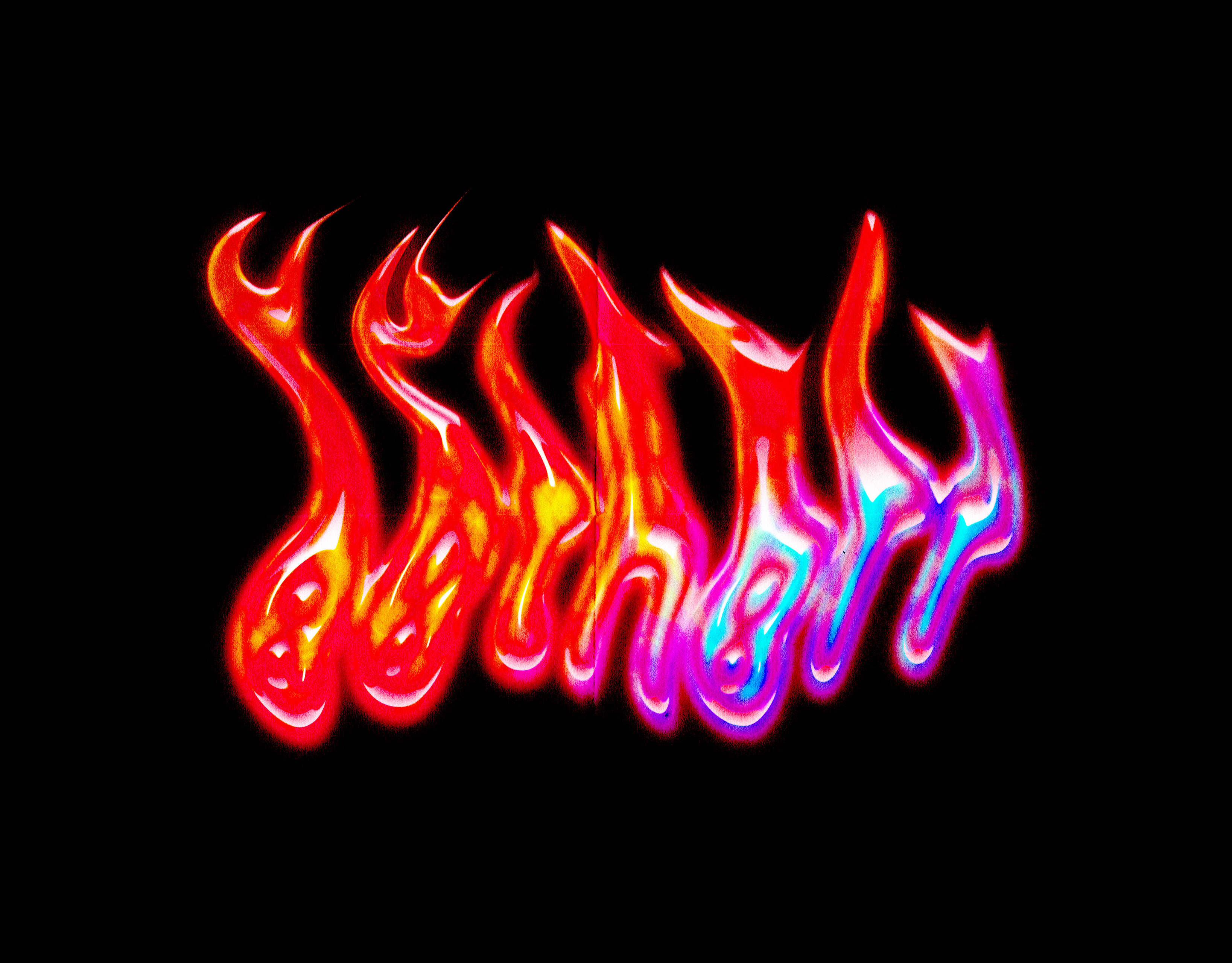
Approach: The creative director discussed and researched different ideas on Pinterest. We are representing underground creatives from all kinds of backgrounds. I created funky typefaces with Blender, so I have some examples below of my exploration of that. I experimented with different typefaces, fonts, and colorways for the cover and logo. I created two logos in Adobe photoshop and illustrator reminiscent of the early 2000s nostalgia design trend.
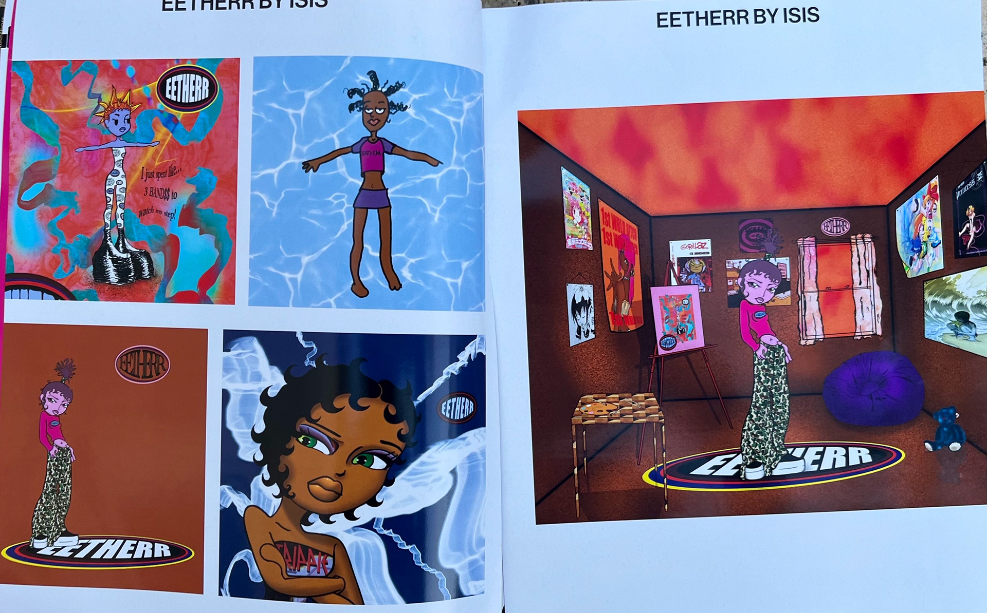
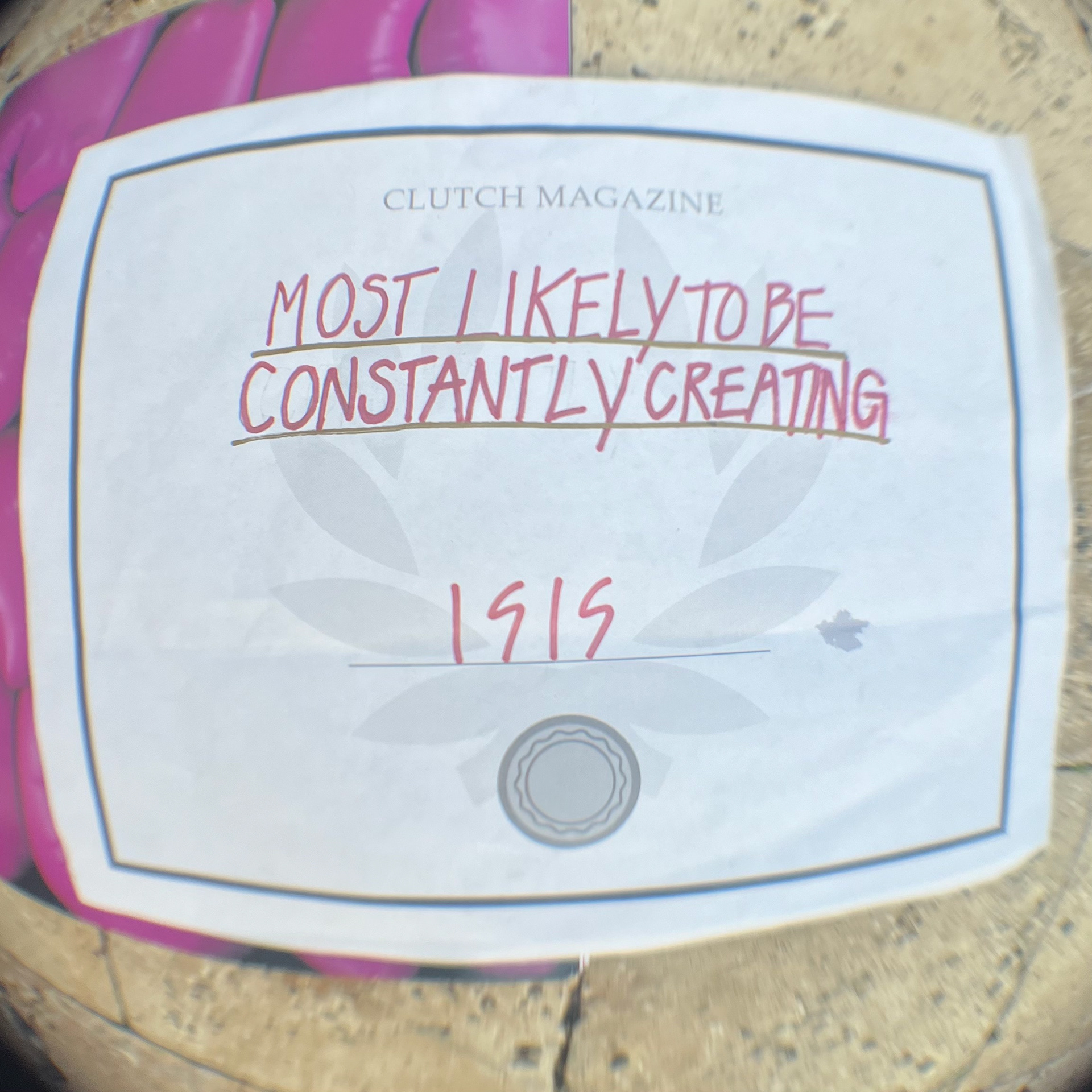
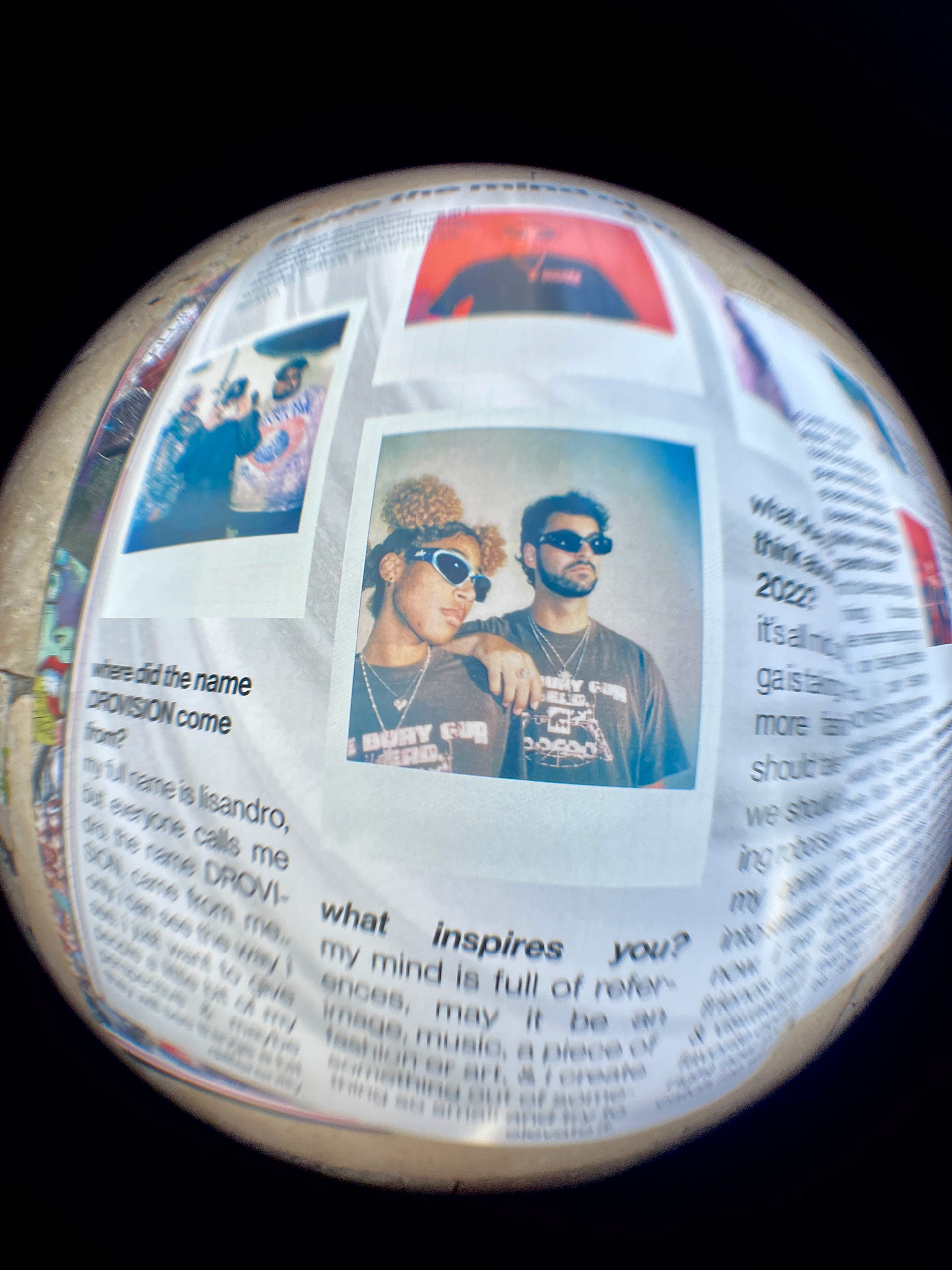
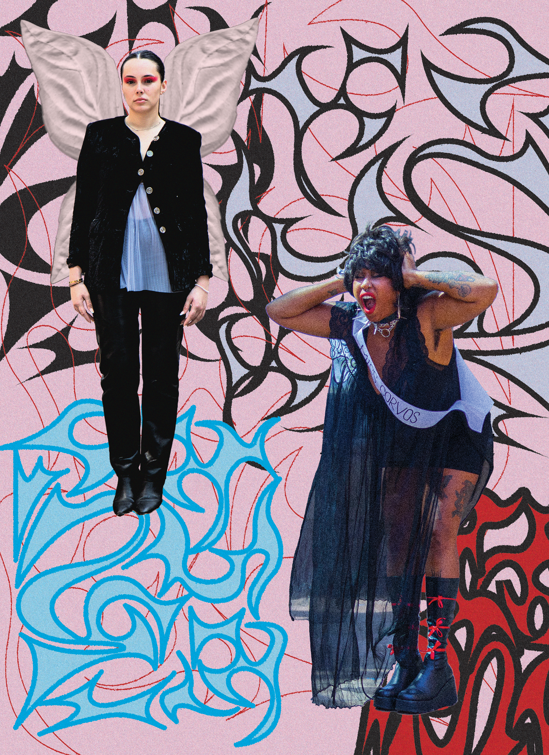
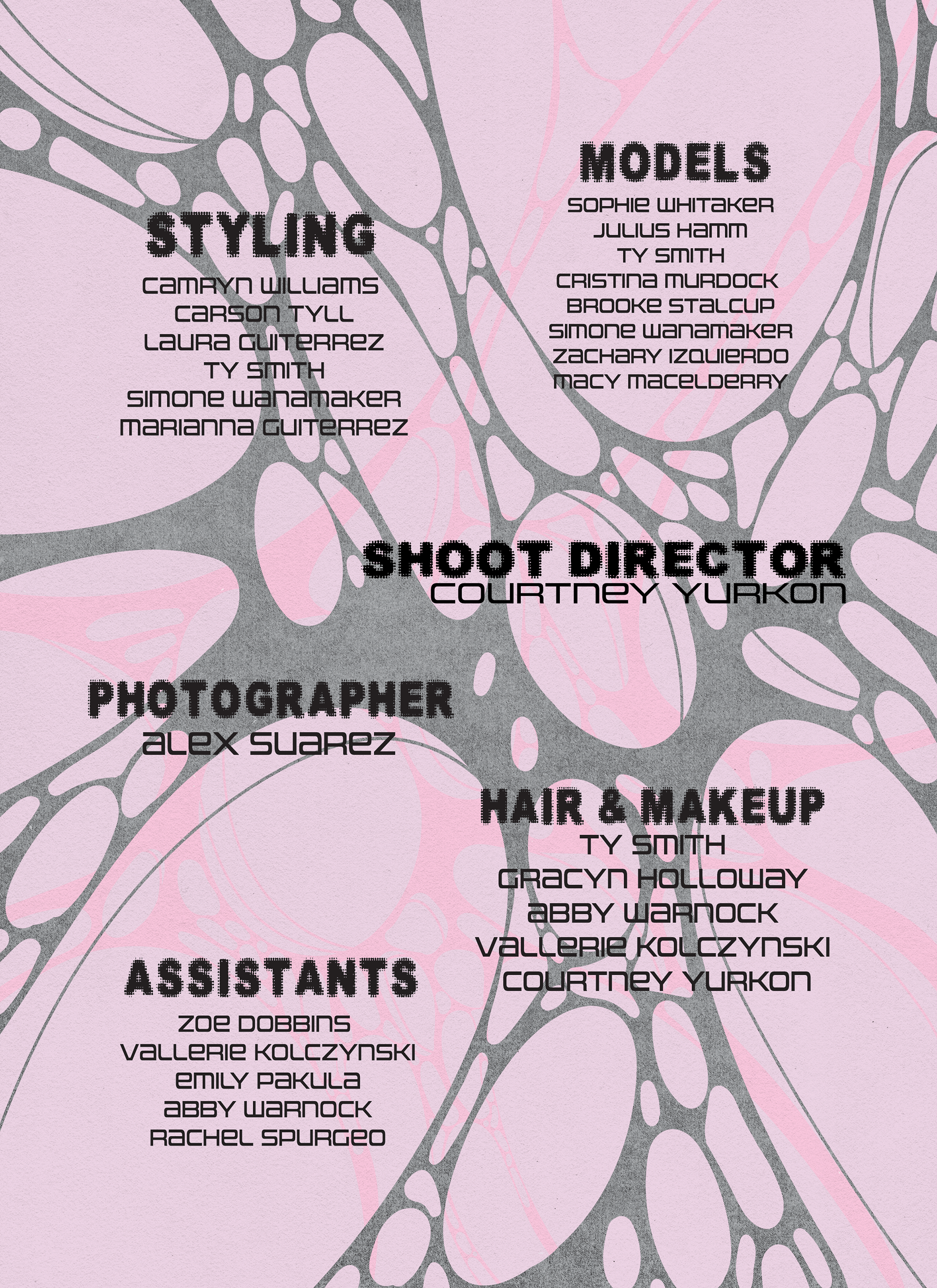
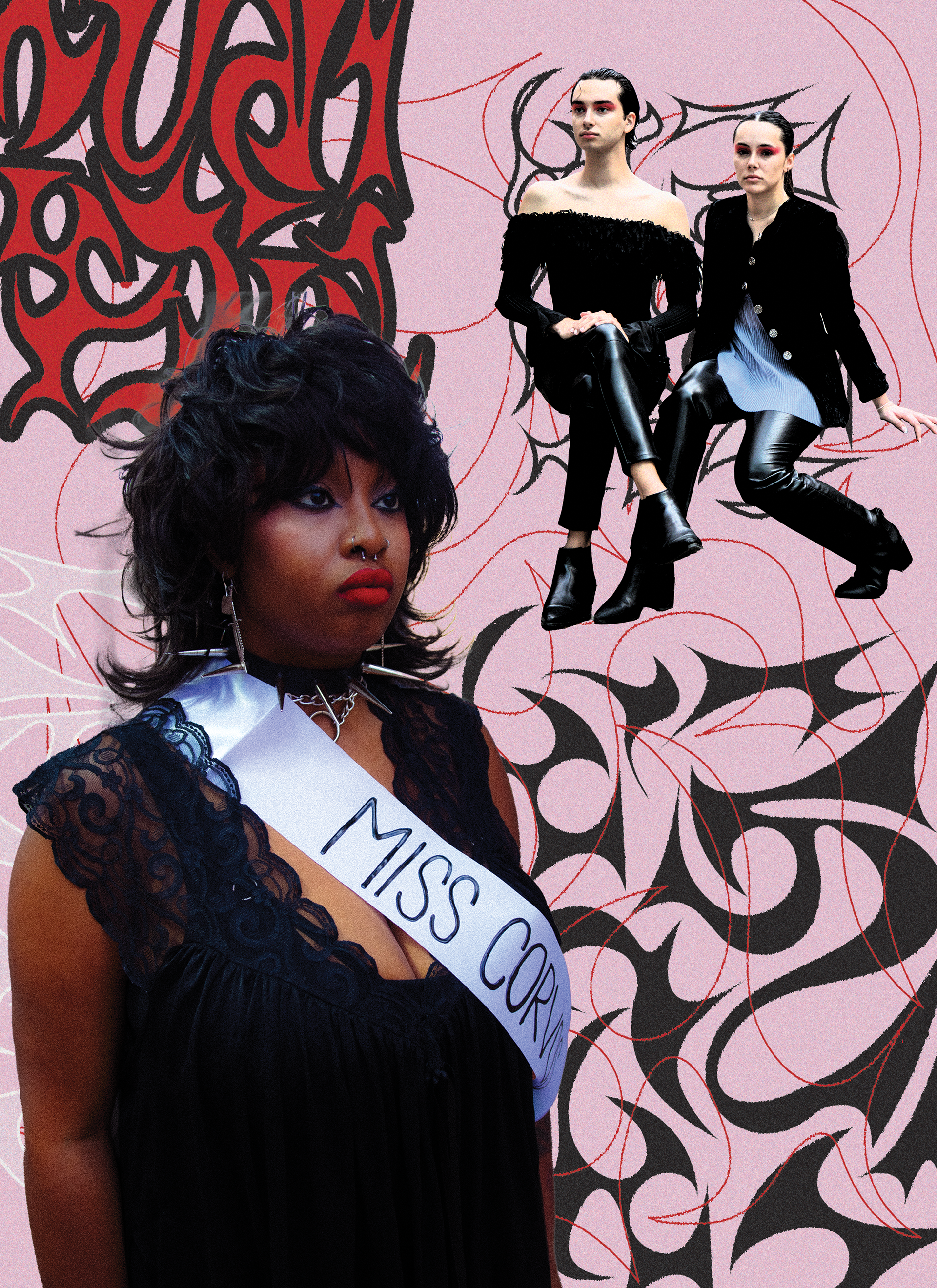
Extension: The creative director and the team were so pleased with the outcome of the cover and logo that they decided to feature my artwork in the magazine as well.
These are the two logos I came up with for the creative director, and we decided on the logo on the bottom.
The image to the right is the final logo used on Instagram (@clutch_magazine). I exported the SVG file from Adobe Illustrator and created the final render in Blender. The image to the left is an alternative colorway we did not use.
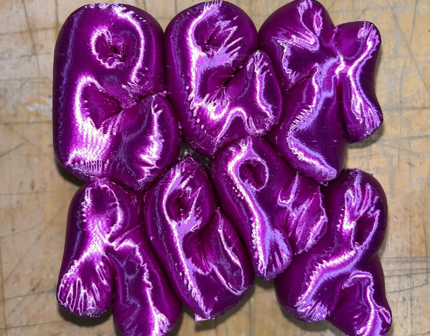
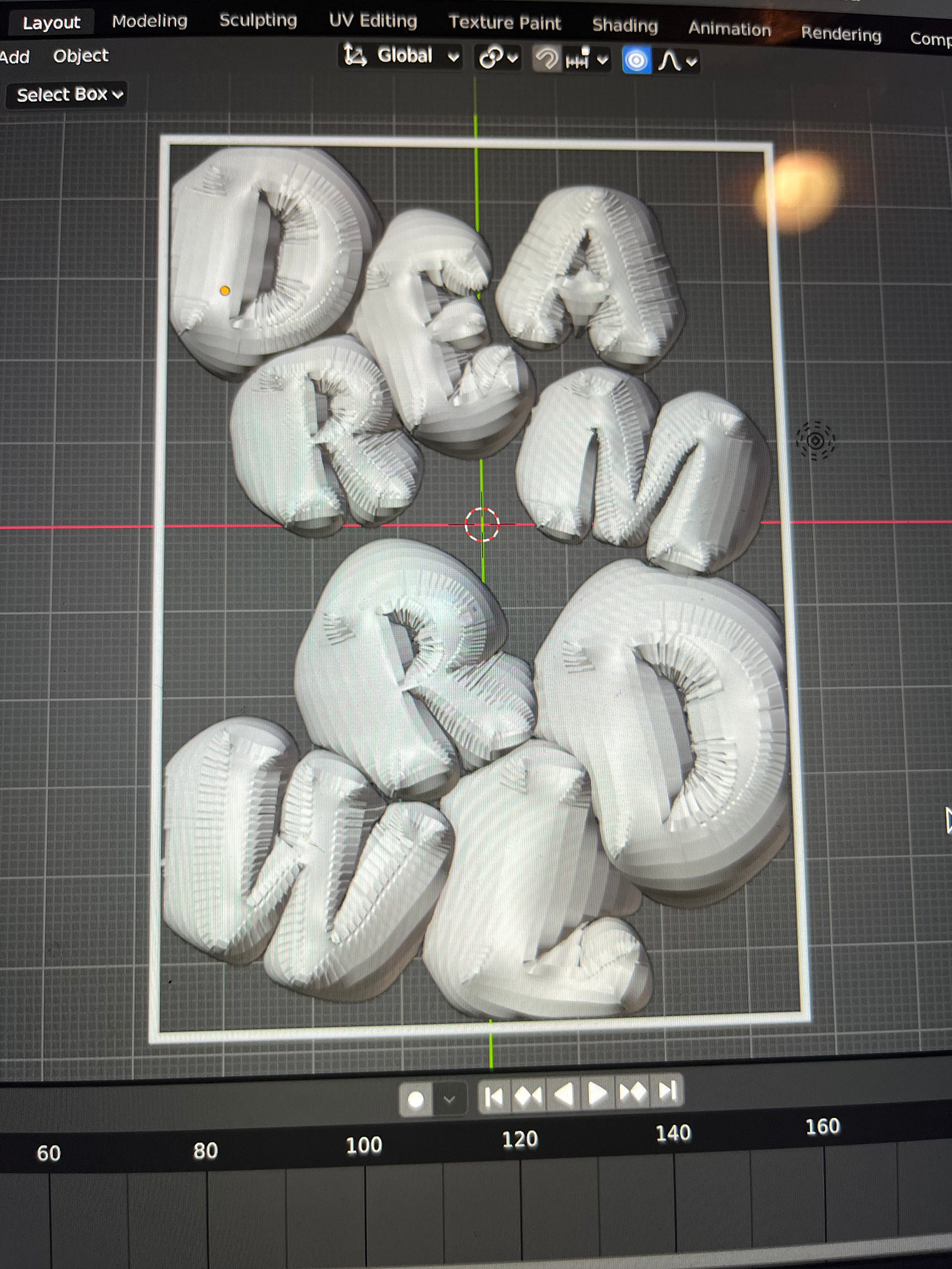
Below is the first variation I experimented with for the cover. I wanted something playful and fun that reminded me of childlike wonder. The balloon-like letters were perfect. I love how it fills every inch of the canvas, undeniably grabbing the viewer's attention. I 3D printed the design as well.

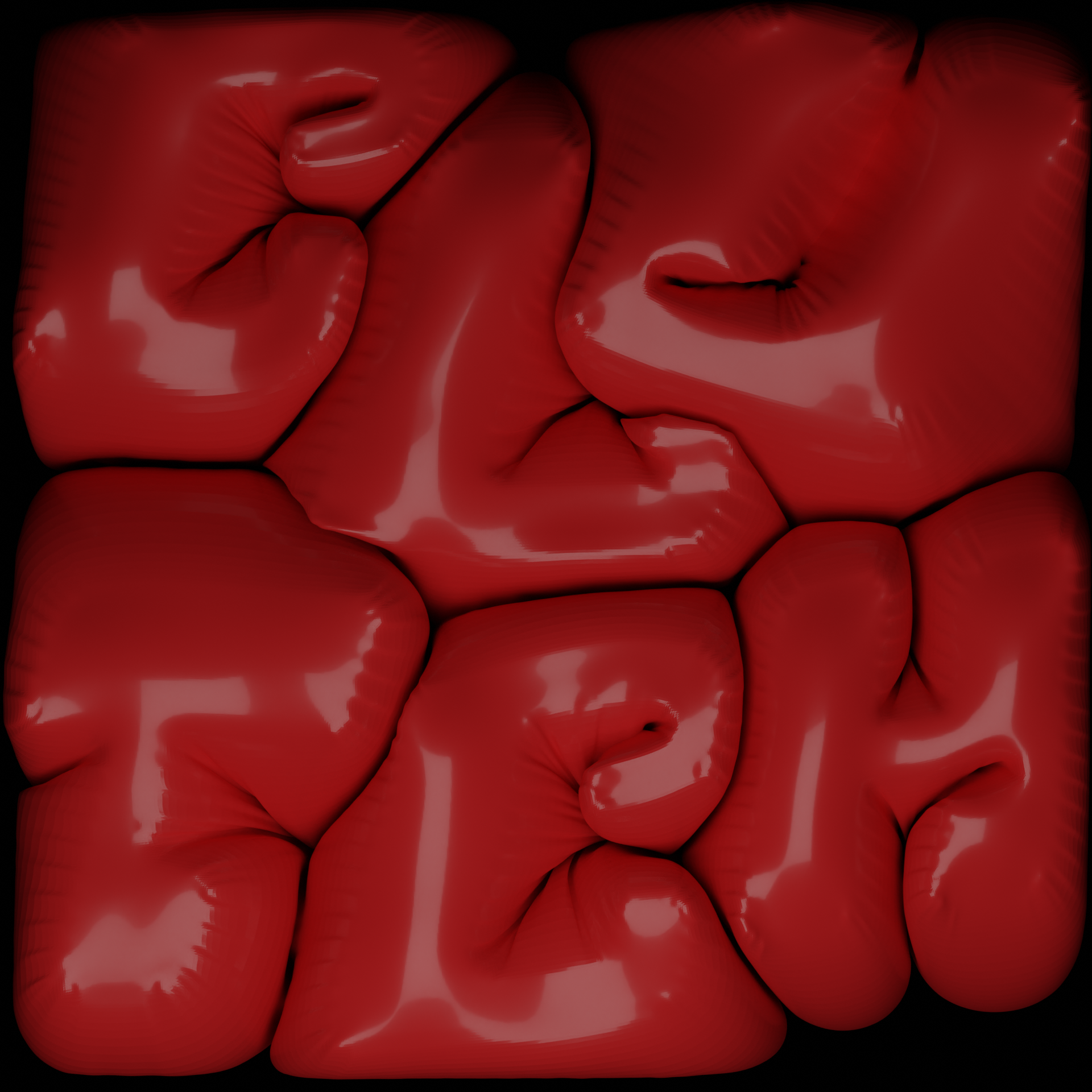
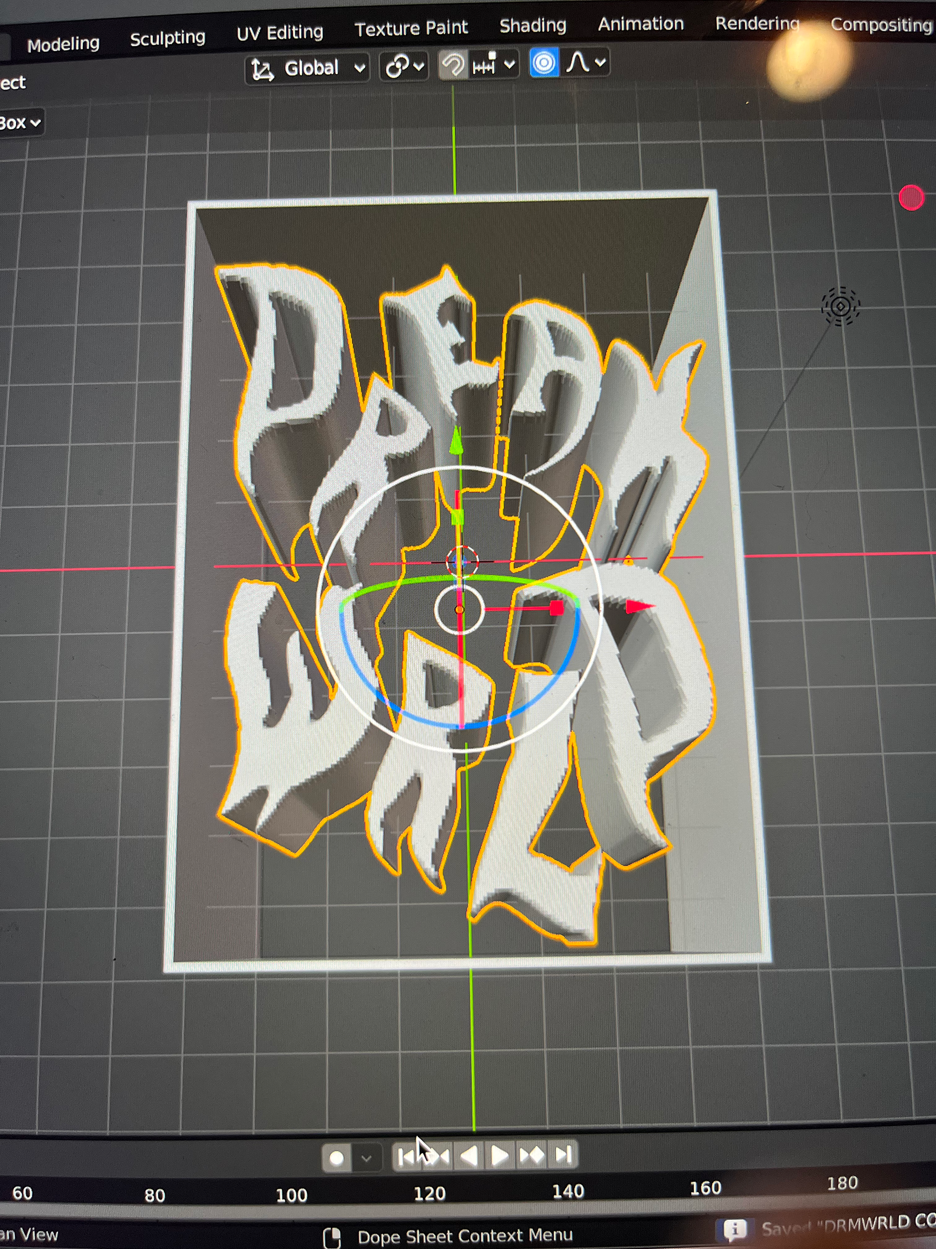
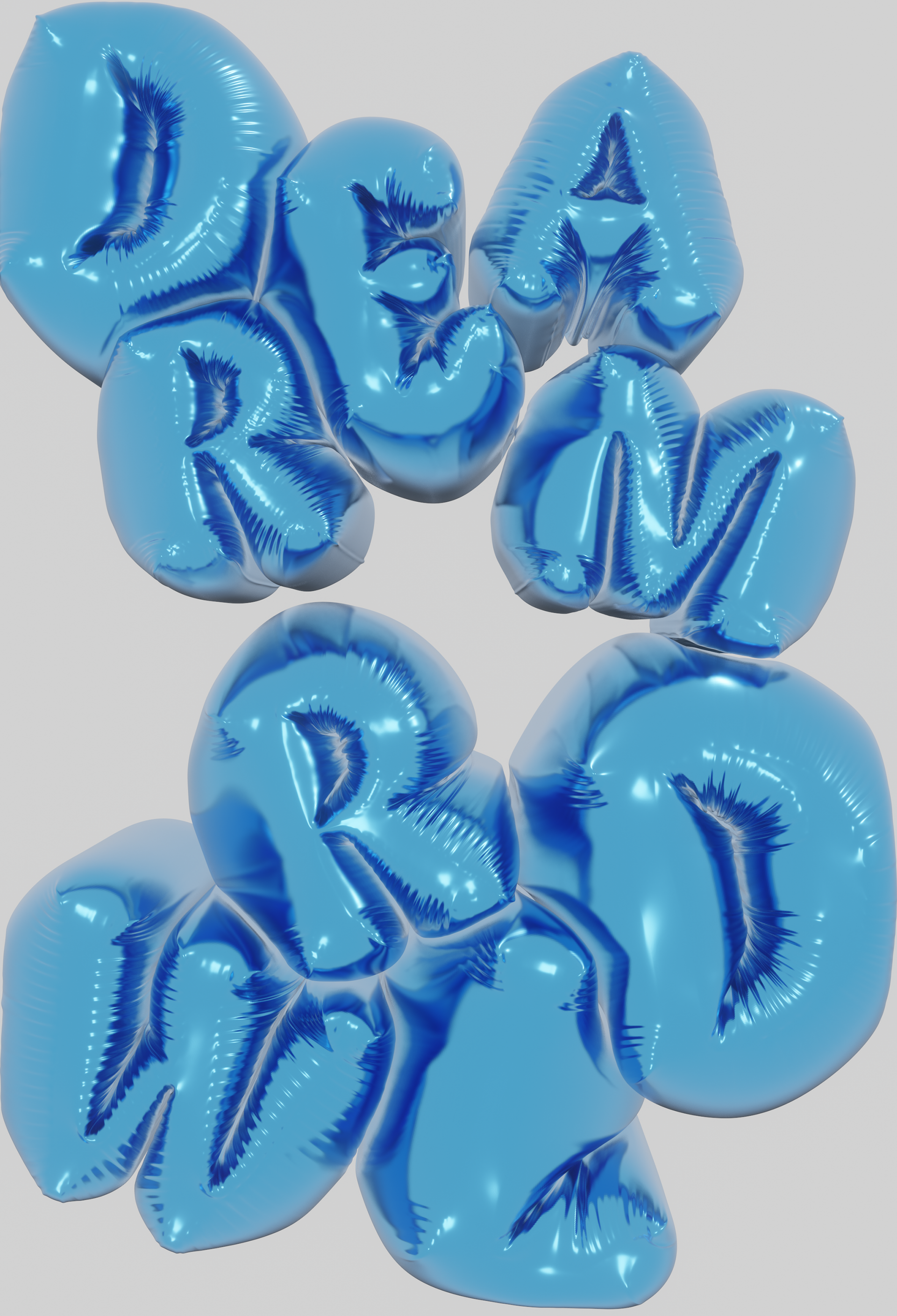
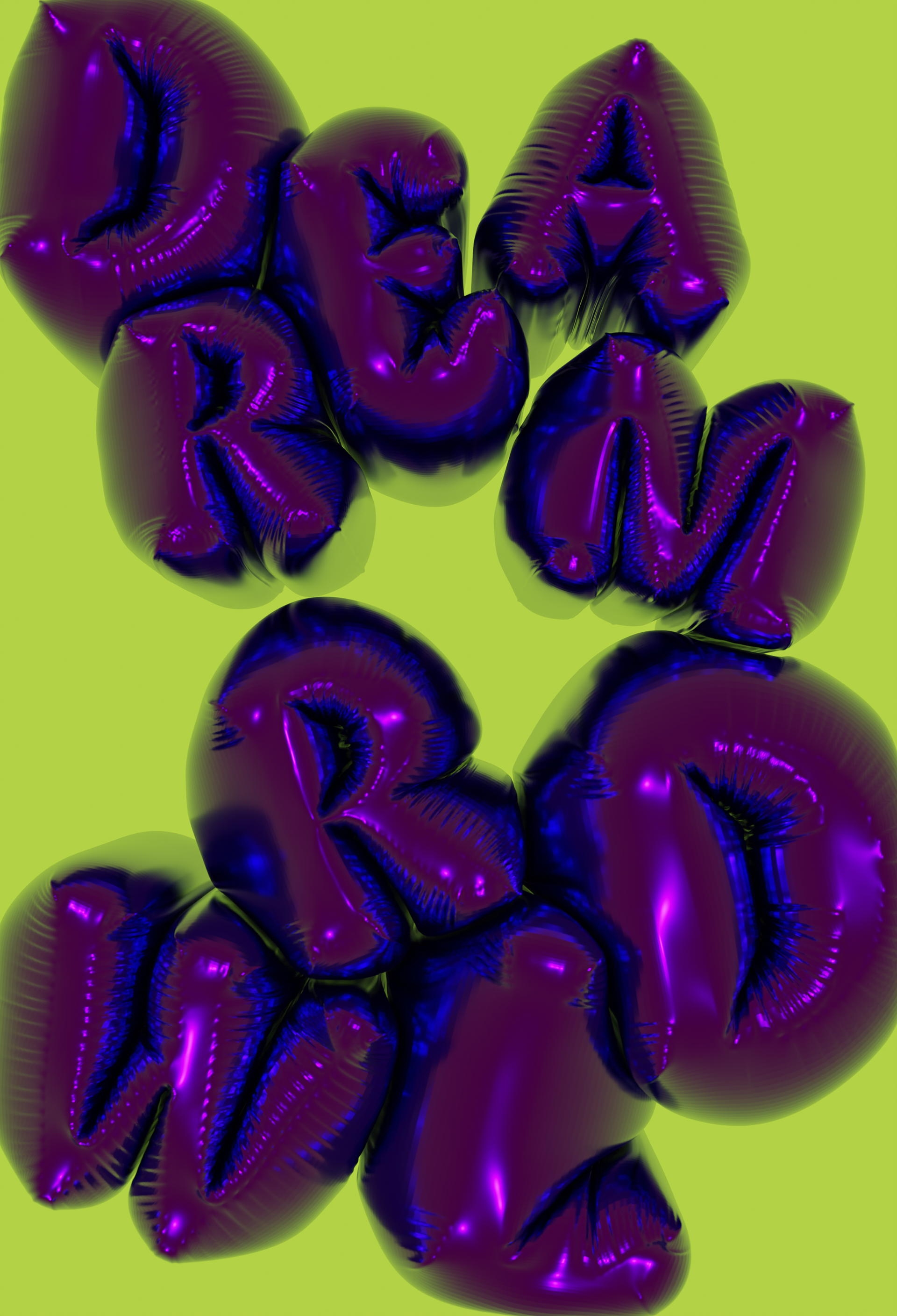
"Dream Wrld" was the theme of Fall/Winter 2022, so I made a render for the second and third pages of the magazine. Below is the final render.
The image above to the right is the final cover for the magazine.
